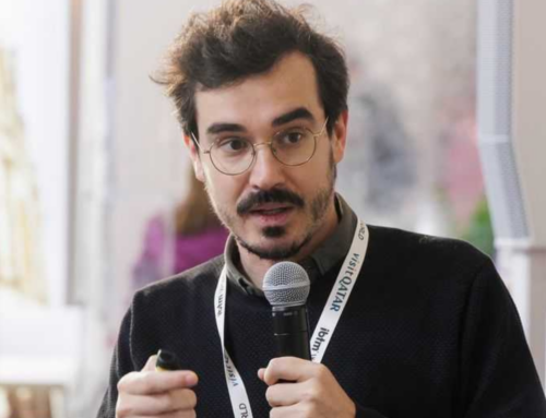
An interview with Hayley Cantor and Nicola Mostallino, the creators of the new MOB website, who share their insights on how to design to reflect the flexibility of the coworking sector.
Over the past decades we have learned that a company must be flexible to keep growing and be able to adapt to a rapidly changing world, but it is true to say that some companies carry flexibility in their DNA, and this is the case of MOB – Makers of Barcelona.
As Hayley Cantor (communication coordinator at MOB 2020–2022 and website designer) said, “Makers of Barcelona is a chameleon-like coworking family and place to call home that is constantly evolving, transforming and adapting in order to be relevant to its context”. And if you are one of those people that stuck around MOB from the beginning, you’ve probably noticed the evolution of this coworking space that started as an old factory with some tables to bring together minds alike.
Coworking equals flexibility. It is an industry that needs to adapt to the ways of working of individuals, teams, larger companies, each with totally different needs. On top of that, coworking is fuelled by everything that happens onsite amazing projects and startups are born, events, meetings and activities are held that add value to the spaces, making them more than just “an office”.
In 2021 MOB needed a new website, and the challenge began: how to extrapolate all this flexibility into a website so that many different users could navigate smoothly and successfully, finding what they need? The answer is by improving the user experience (UX) and a team of two people who know better than anyone what it’s like to work in the coworking environment: Hayley Cantor (Studio Ayl) worked for MOB as a communications coordinator for two years and then became a freelance designer. Nicola Mostallino has been working at MOB for many years, so as well as being an expert in web development, he really knows what it’s like to be a coworker. They teamed up to develop the new website, and we interviewed them to talk about the challenges of this project.
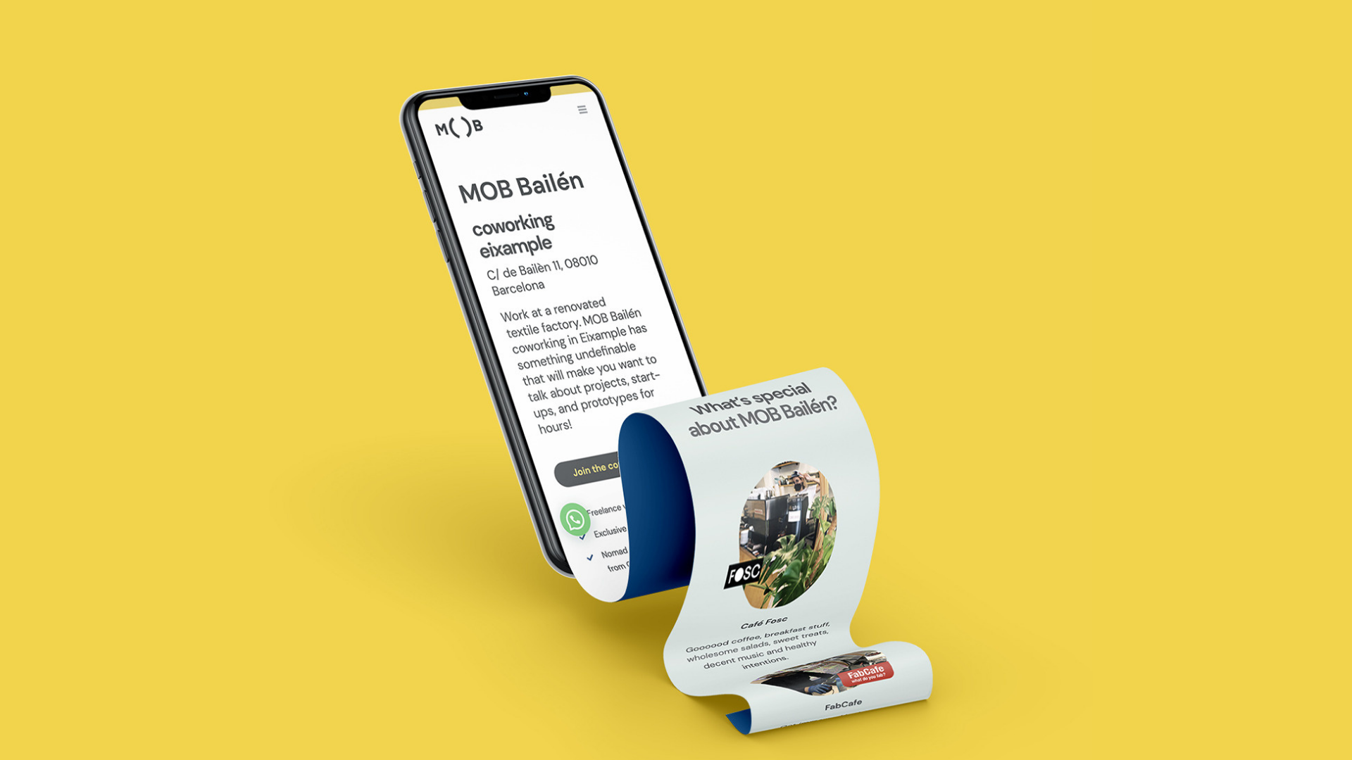
- What will a user find when they check out the MOB website?
- Nicola: A quick and easy to navigate website, tailored to the needs of the user with different points to satisfy real needs such as calling, requesting info or subscribing. The website has been made for desktop but is more mobile friendly as 80% or more of the visits come from smartphones.
- Hayley: From a visual and content design point of view, we have taken the opportunity to update the visual identity of Makers of Barcelona completely, including more information about memberships, new photos and FAQs.
- What was the biggest challenge in redesigning the MOB website?
- Nicola: Optimising usability and pushing the call to action to increase lead acquisition in particular.
- Hayley: Also thinking more long-term… how to organise the information to make it as modular and scalable as possible, knowing that as Makers, MOB tends to cover a lot of different projects and be constantly evolving as a community, we didn’t want something that would be limited in the future.
- What UX Design trends did you implement in the new website?
- Nicola: This is more Hayley’s thing, she’s been the main author of the UX, I’ve just been pouring it into the website dynamically 🙂
- Hayley: I would say that this particular project has been about trying to stay away from trends in order to design a website that will last for years to come (as far as technological advances allow!). Working in the MOB team for a couple of years gave me a lot of insight on a user level: what are the things they ask about, how they tend to look for a coworking space, what types of services are important for each of the memberships, for example. This gave us an advantage in terms of information hierarchy because we were able to organise the content more focused on the user’s point of view, and organise everything in a way that reflects the needs of the people using the website much more.
- Why is it important to think about user experience on a website?
- Nicola: Because a good bike is not the one that shines from far away, but the one that goes far away and that’s why it needs to have good mechanics, not a good colour 🙂
- Hayley: A comfortable, enjoyable and memorable journey. That nobody gets a pain in the arse after a ride. Best metaphor ever Nico 😉
- What would be the next UX challenge to implement on the MOB website?
- Nicola: Adding languages to be able to reach all those users who are not comfortable with English. Ok MOB is very intercultural and English is the easiest language to communicate with different cultures, but we are in Spain and Catalonia, so to improve the potential impact on the local market we need Spanish and Catalan.
- Hayley: 100%. A website is a living thing. You have to feed it often and take care of it. Surely there will be changes over time, depending on what the user and the business needs.
We hope that all these insights will be useful to others, and we are grateful to Hayley and Nicola, for their incredible work and dedication, and for being part of this innovative community.